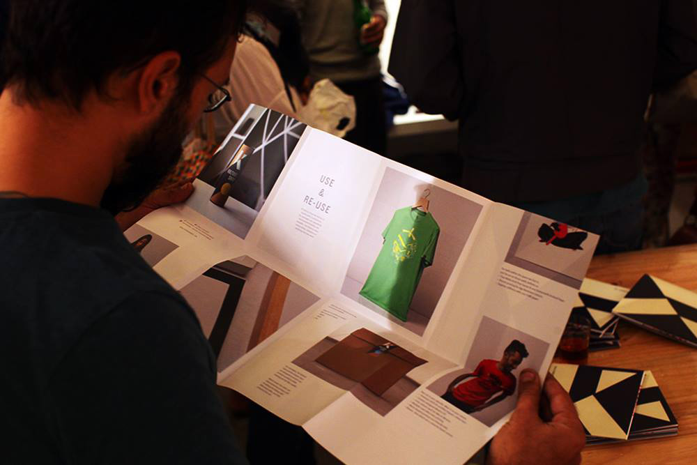
Whether working with clients or art institutions Kunal’s creative practice is where culture and community meet. He bridges the gap between mainstream and alternative spaces. His process is driven by research-led design thinking and agile workflows. With an aim to create work of a high caliber that is sustainable, accessible, and affordable.
The case studies below showcase his work connecting with both local and global audiences.
Whether working with clients or art institutions Kunal’s creative practice is where culture and community meet. He bridges the gap between mainstream and alternative spaces. His process is driven by research-led design thinking and agile workflows. With an aim to create work of a high caliber that is sustainable, accessible, and affordable.
The case studies below showcase his work connecting with both local and global audiences
SERVICES
Art & Design Consultancy / Project Management / Curation / Artist Development / Creative Direction / Brand Strategy / Packaging
Client -
Adidas
Originals
Project -
Limited Edition Collectables
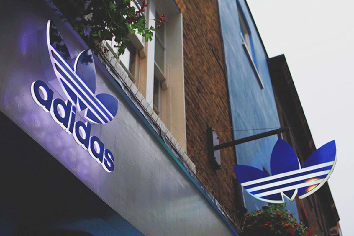
Artwork for the opening of the new Adidas Originals store on Linking Road Bandra, Mumbai.
Artwork for the opening of the new Adidas Originals store on Linking Road Bandra, Mumbai.
Visual Identity
Packaging
Merchandise
2018
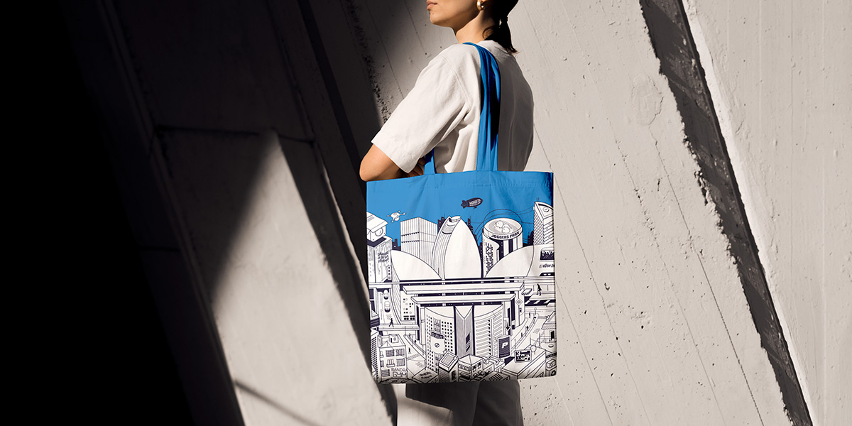
Bandra 400050 - Looking for inspiration from the past, present and future
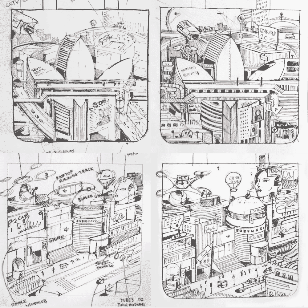
Inital sketches by curated graphic artist Broti Bhattacharya
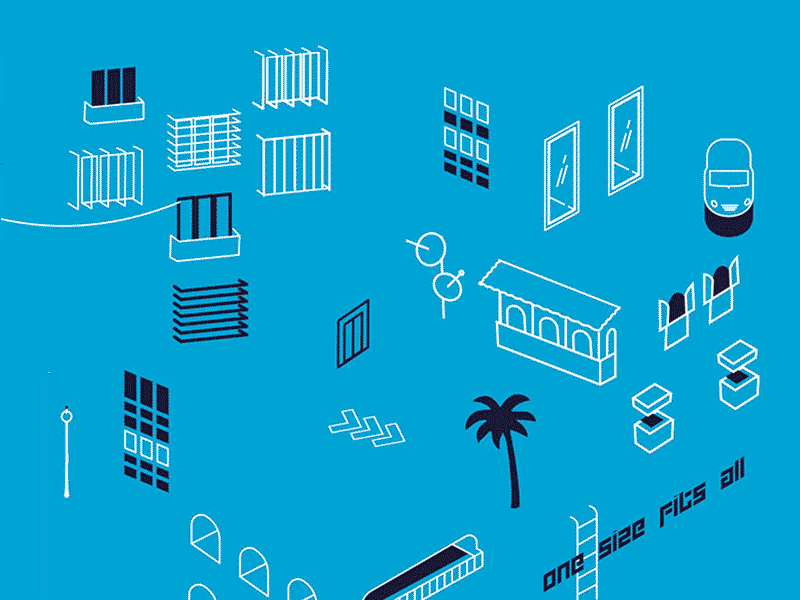
Building blocks inspired by the near future
"Recreate cultural moments. Remake the past your way. Original is never finished."
APPROACH
Linking Road is a bustling playground of subcultures, where couture boutiques are neighbors to market stalls of street fashion. This urban dynamic hud was chosen as the site for the second Adidas Originals concept store in India. To commemorate the launch, we designed a sci-fi map showcasing the new Adidas store in this thriving neighborhood. The core idea pays homage to a metropolitan singularity where the past, present and future of culture meet, intermingle and evolve.
The foundation of the project was the brand’s global tagline. Inspired by the detailed illustrated cityscapes inspired by the graphic artist Broti Bhattacharya, I took his hand-drawn style, conceptualised it around the brand’s tagline, and applied it to the store’s surroundings. The architecture, signage, and nightlife of the suburb were captured, stylised, and rendered into individual building blocks that could be infinitely rearranged - speaking to the ever-evolving nature of originality.
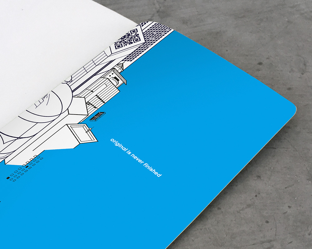
A5 Notebook - Section Bound / 150 pages / 300 gsm matt laminated cover
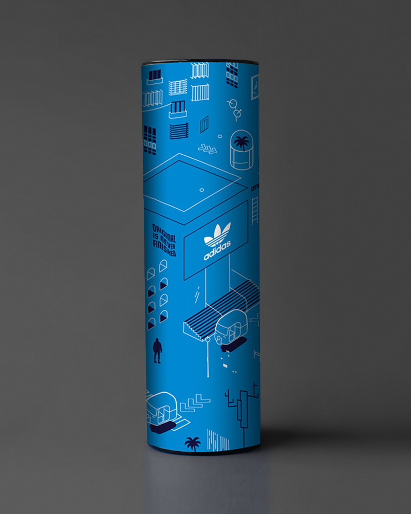
Tube - Custom packaging for A3 poster
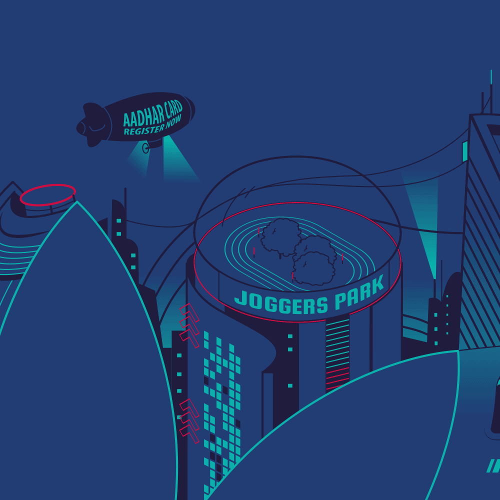
A3 Poster Detail - Joggers Park / Aadhar Card Registration (Goverment ID card) / Bandra Gymkana
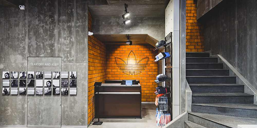
Adidas Originals - Concept Store, Linking Road
OUTCOME
The final artwork was adapted across a range of products, canvases and media - both physical and digital. The brand embraced the idea of hosting free skill-boosting workshops including coding bootcamps for all ages in the store to inspire new perspectives.
Illustration by -
Broti Bhattacharya
Kunal Anand
Merchandise Partner -
Kulture Shop
Client -
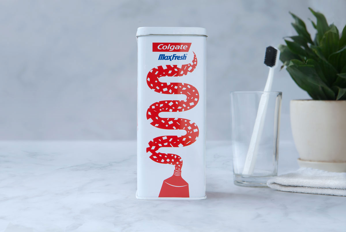
Colgate Palmolive
Project -
MaxFresh Packaging
Collectible packaging that is both dynamic & cost-effective yet able to speak to a wide Indian demographic.
Visual Identity
Illustration
Packaging
2014
APPROACH
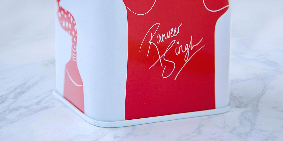
As one of the prime products in their suite of FMCG, Colgate MaxFresh needed to secure their position in the market as a youthful and high-energy brand. Iconic actor Ranveer Singh was the brand ambassador and featured on the TV commercials for the product and their unique “cooling crystals”
The basic square of the crystal was translated as a signature brand element to manipulate form, dimension and depth to explore a wide range of graphic pattern possibilities. In so doing, we illustrate a narrative that echoes across the MaxFresh story throughout media and visual merchandising for retail.
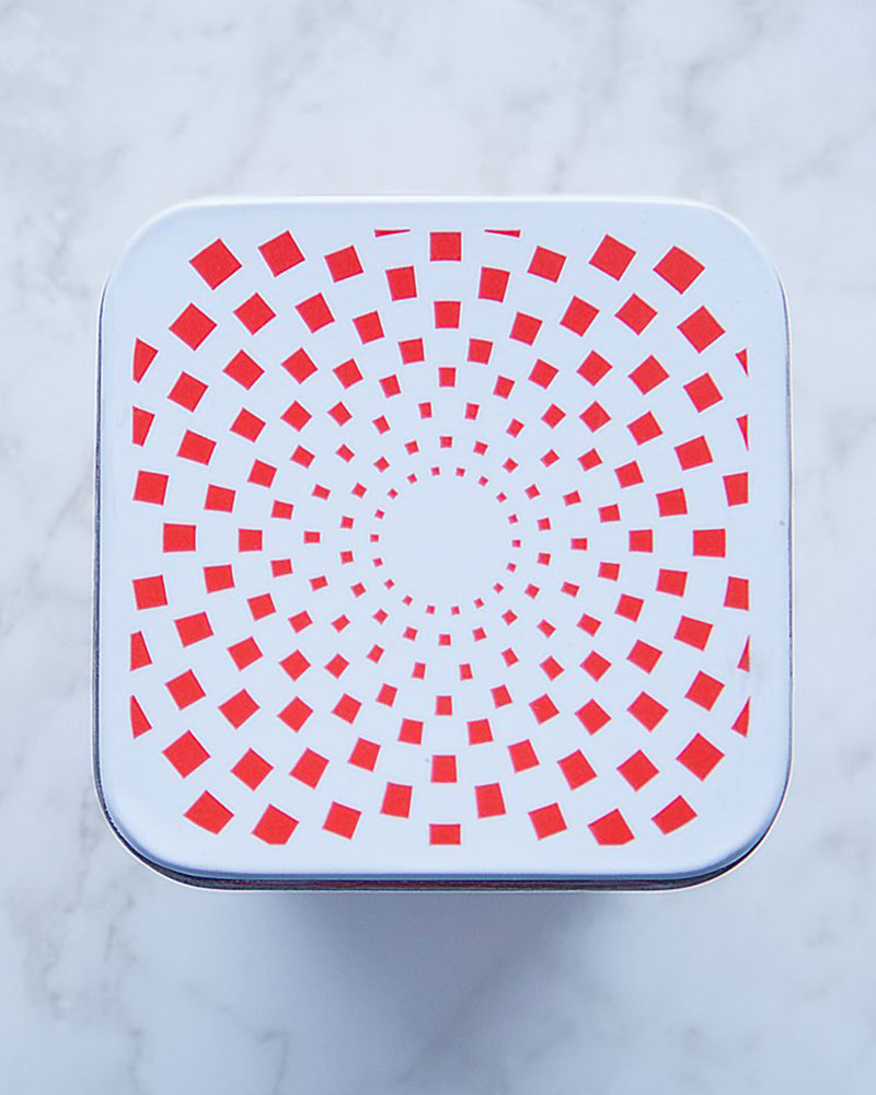
Celebrating the explosive nature of the brand through graphic forms
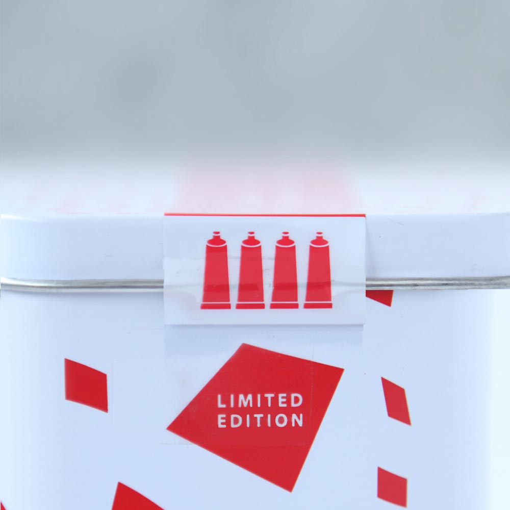
Communicating the value and assecibility at Rs 299
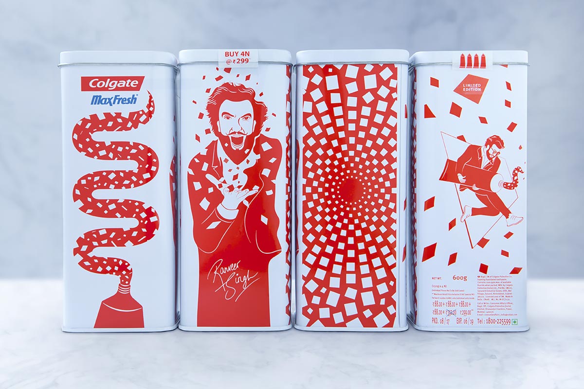
Providing a diverse range of merchandise options within the brand narstive
OUTCOME
The trick was capturing Ranveer Singh’s explosive energy via graphic design and illustration, with the use of negative space to directly tie the product and its aim back to the brand. Keeping it simple, dynamic, crisp, and clean. The duotone palette aided cost efficiency at the production stage, keeping the product both high quality and accessible to all. Customer satisfaction was recorded at an all-time high with the tins sold out within three months from launch. Unboxing videos and resales online support the data that the packaging connected with a wide range of Indian consumers.
Photography by -
Hrishikesh Shinde
Client -
Kulture
Shop
Project -
Kulture
Shop
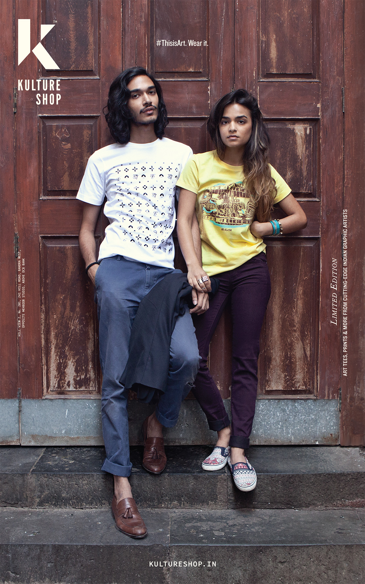
Creating an ecosystem for Indian graphic artists to flourish.
Co-Founder
Visual Identity
Curation
Typography
Packaging
Merchandise
Retail
2014
2014 - Kulture Shop, Bandra
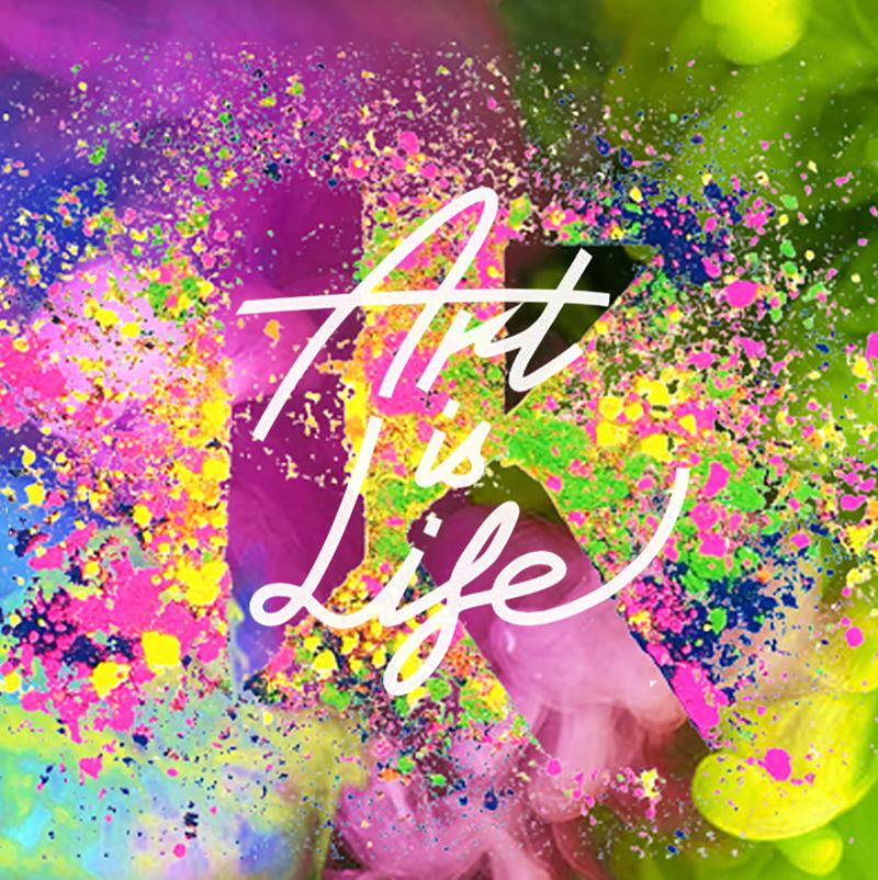
“Redefining Indian visual identity in the 21st century.”
APPROACH
Kulture Shop is an evolving creative endeavour empowering the Indian graphic art scene with it’s foundations rooted in a curated collective of Indian graphic artists from around the globe. The platform aims to spearhead an art movement that seeks to redefine the Indian visual identity in the 21st century.
Today’s art is no longer restricted to galleries and walls. Today, art lives on new canvases of self expression and represents our evolving Indo-global identities. #Supporttheartist
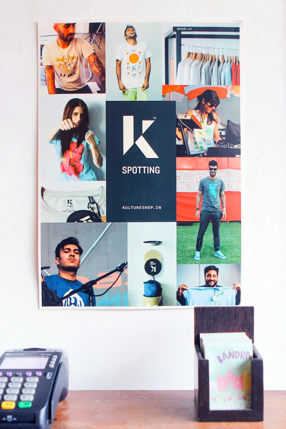
Behind the scenes
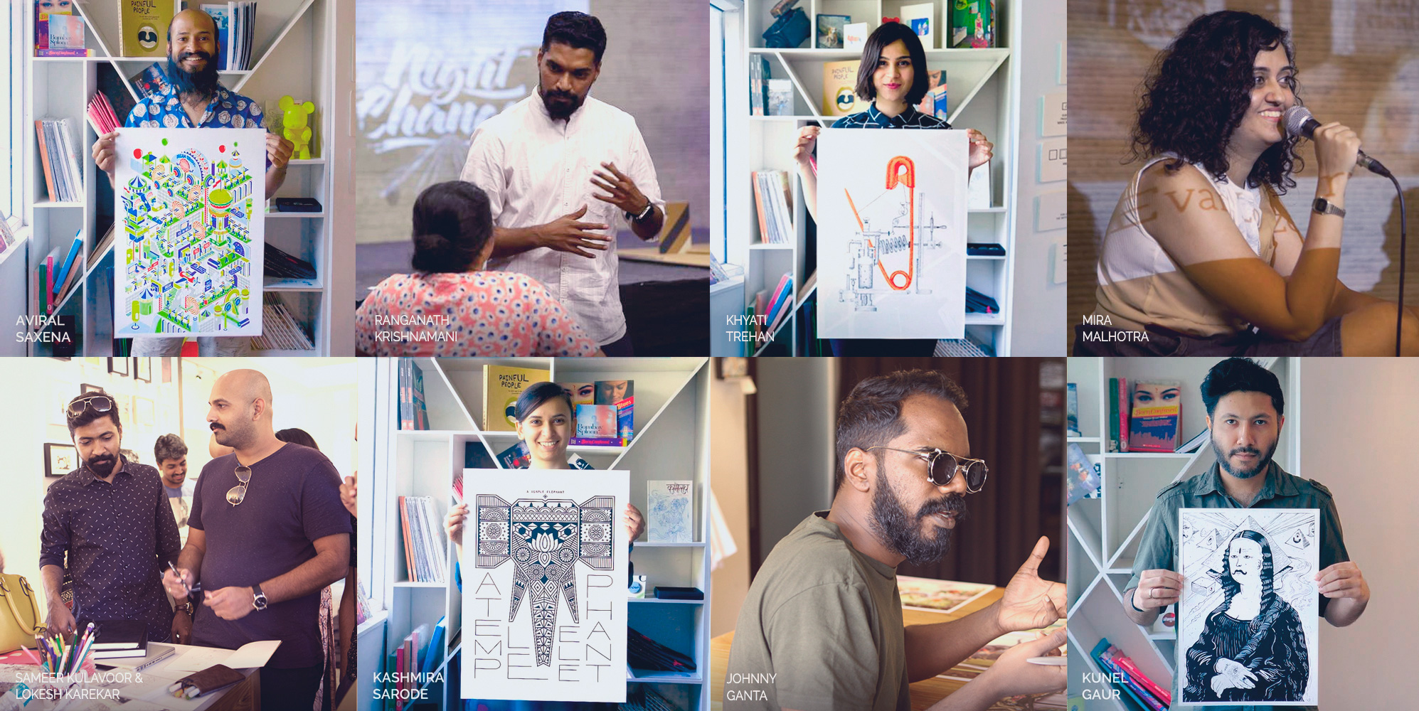
Leaded Indian graphic artists from around the globe.
“The Artist are Our Heroes”
MISSION
Kulture Shop's mission is to lead, shape and introduce the world to a new genre of Indian art and artists that is bold, confident and culturally relevant, using graphic art as the vehicle to democratise art by making it affordable, more accessible and relatable.
By supporting the growing design community through mentoring, and workshops (Sketchbook Sundays). talks (Artist, Know Your Rights), Artist Meets, local and global exhibitions, copyright infringement advice, KopyCat initiative, and supporting causes close to our hearts.

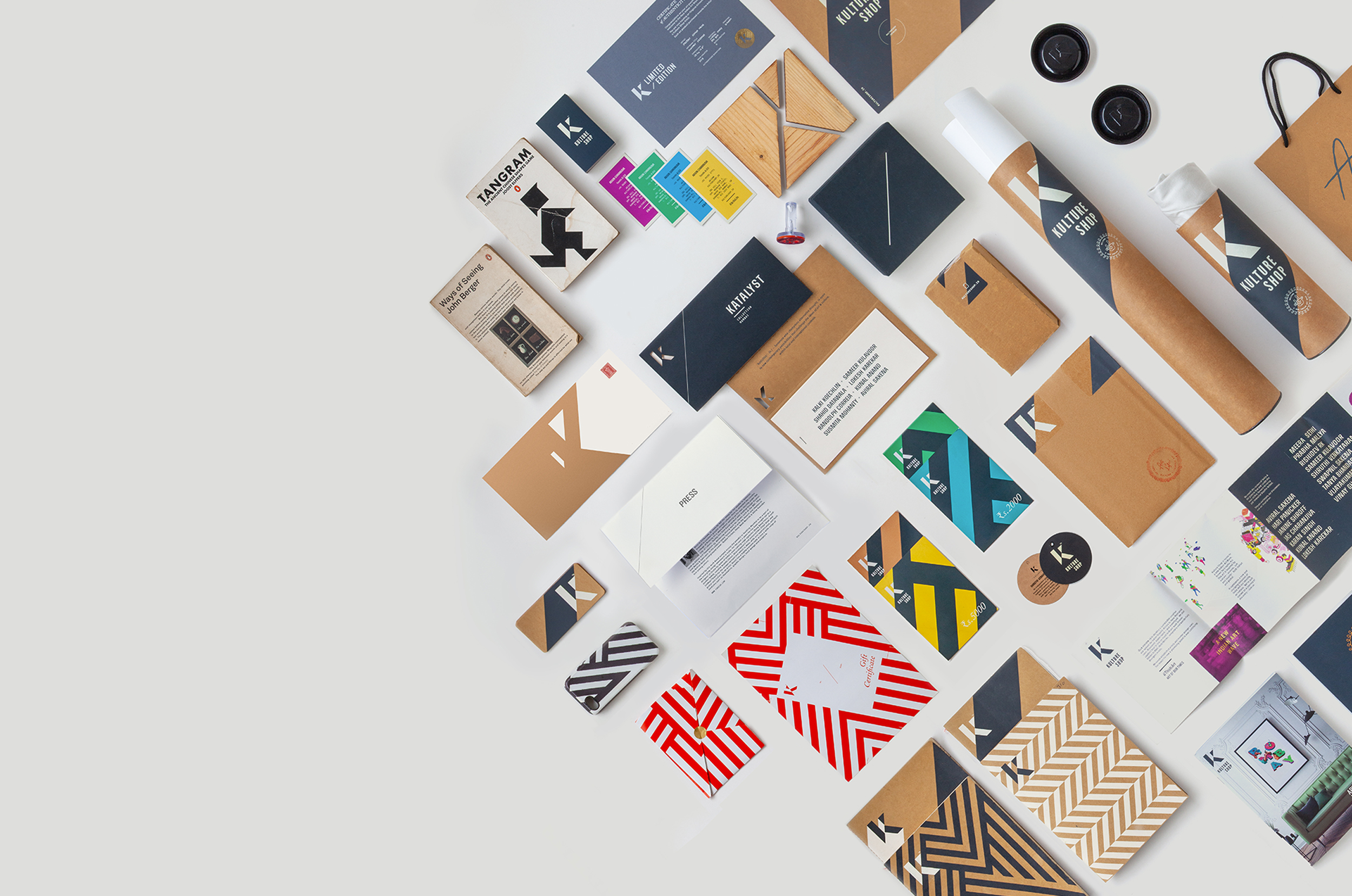
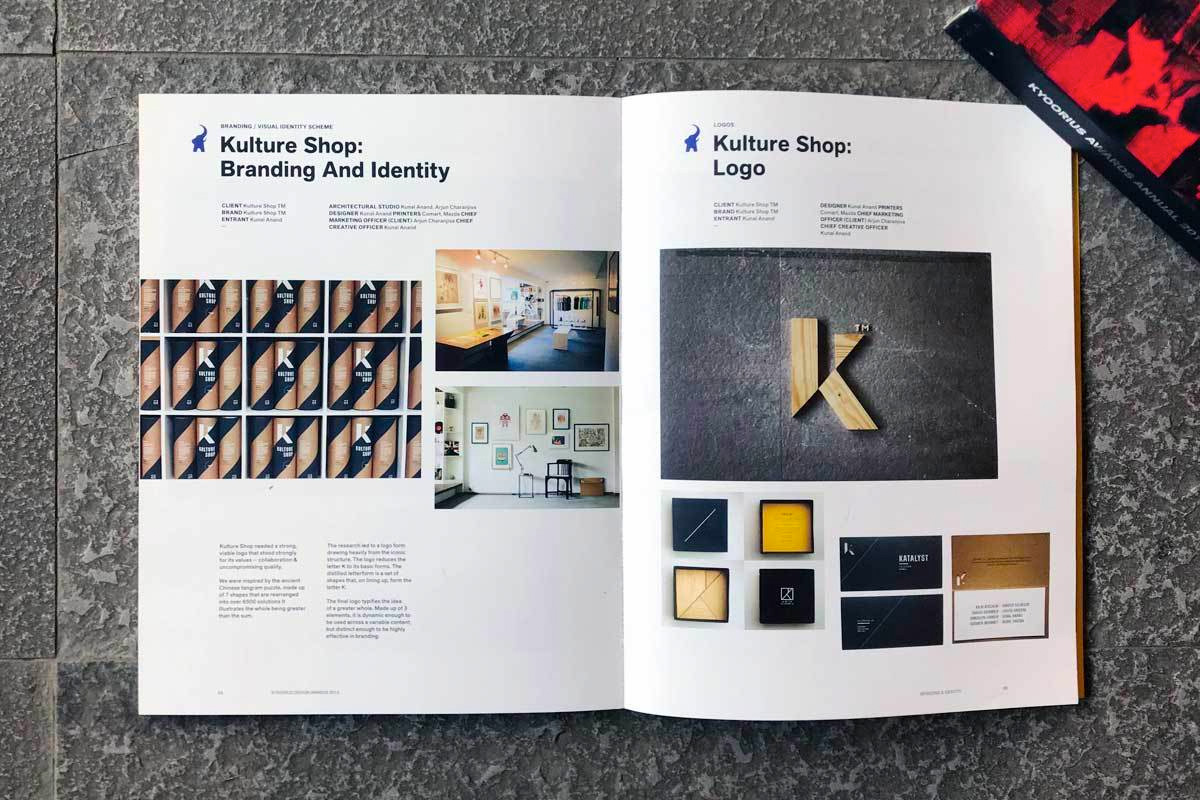
BRAND IDENTITY
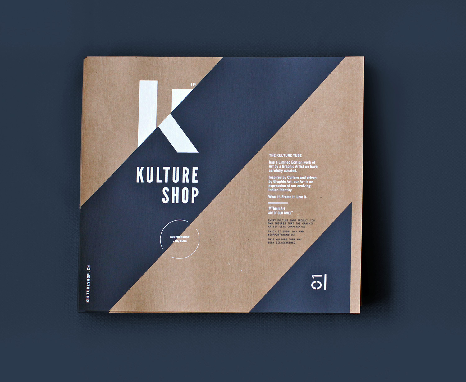
The mission and ideology of Kulture Shop necessitates a strong visual to represent the values of collaboration and uncompromising quality. Inspired by the Chinese tangram puzzle that can be rearranged into multiple variations, the logo reduces the letter K to its basic forms with each part representing art, design and culture. Aligning on a 47 degree axis the final logo echoes the idea of a greater whole.
The three primary brand colors craft brown, bullet grey, and white, allows the identity to be bold and instantly recognisable, while allowing the graphic art it promotes to shine. The logo is coupled with Jonathan Hoefler and Tobias Frere-Jones classic tall sans Knockout, with a monospaced font used for detailing. The final unit is dynamic enough to be used effectively across branding, packaging, and communications.
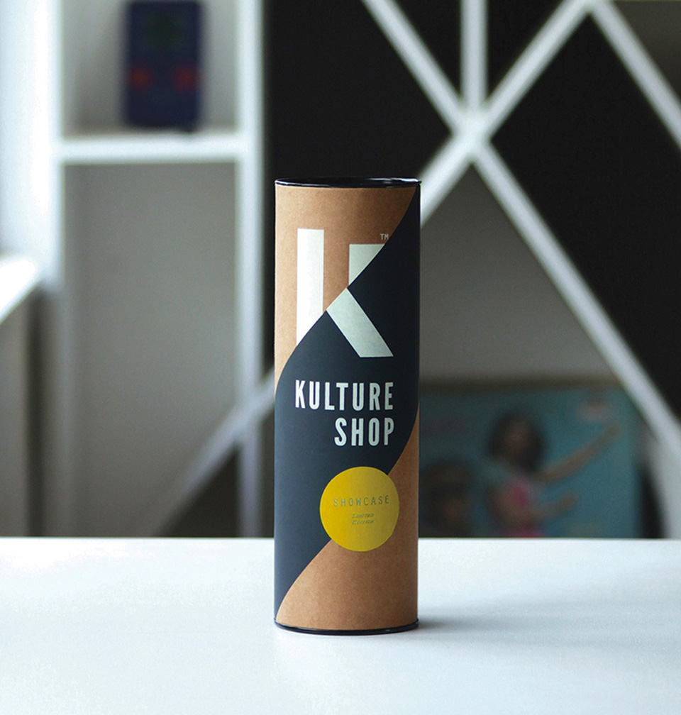
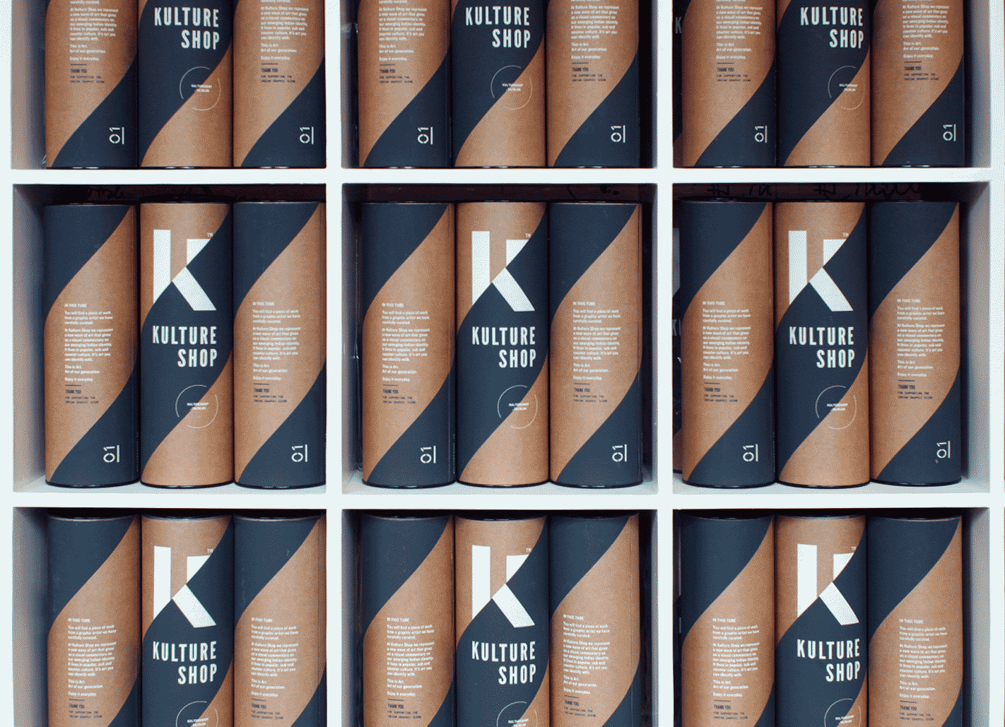
Kulture Tube - Working with local craftsmen from silkscreen printers through to manufacturers.
The packaging suite protects a range of art and lifestyle products. whilst remaining eco-friendly.
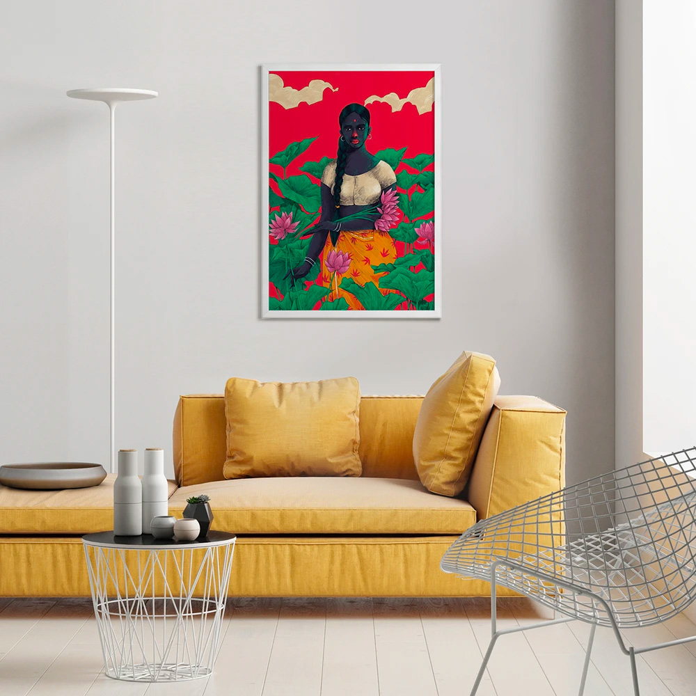
Artworks available on a canvas of your choice.
Curated artist - Muhammed Sajid
Photograhy by - Pratna Singh
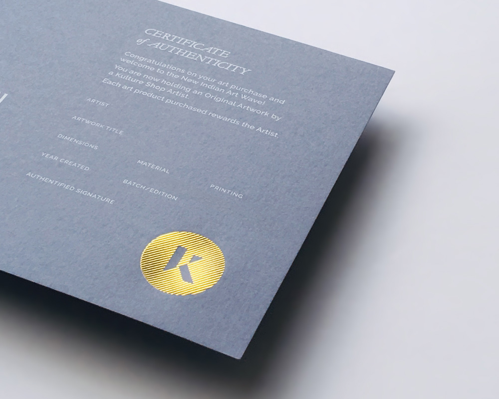
Limited Edition Certificates - Silkscreened with gold foil emboss
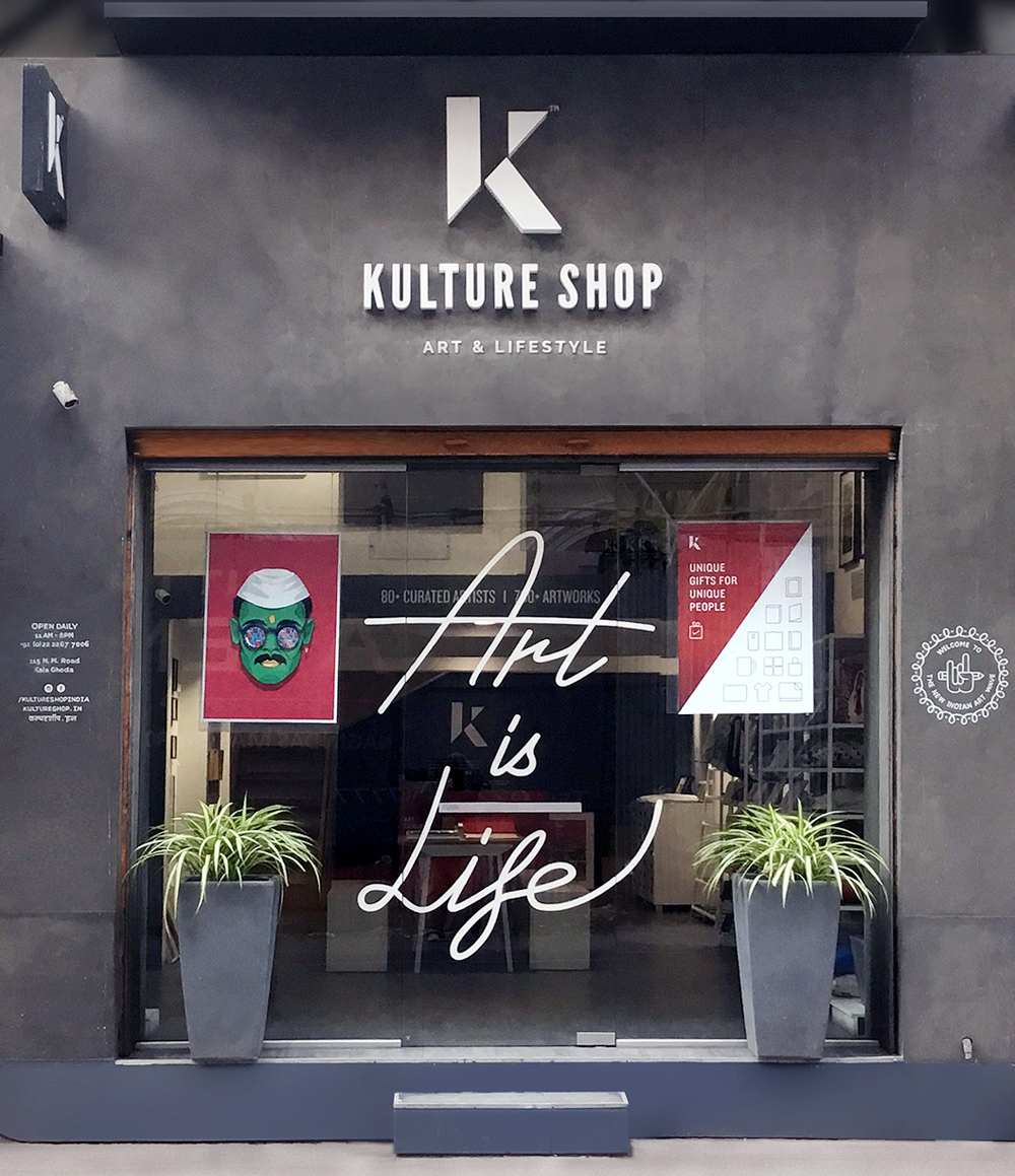
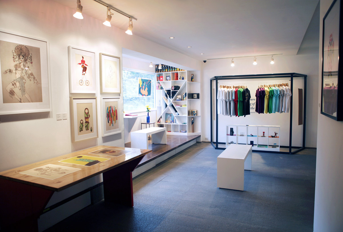
2017 - Kulture Shop - Kala Ghoda, Mumbai
Located in Mumbai's art district
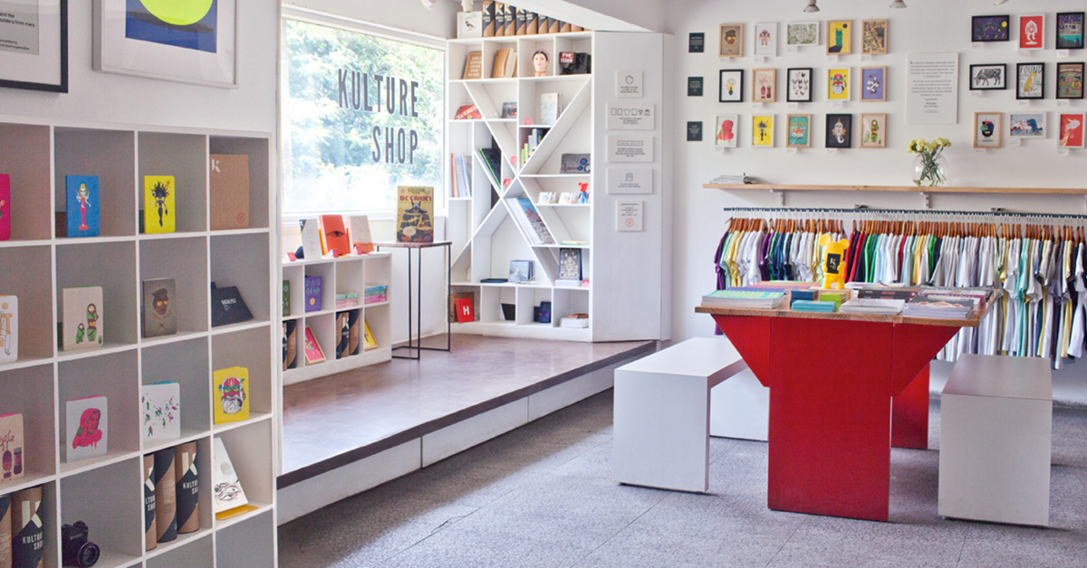
2019 - Kulture Shop - Bandra, Mumbai
ART GALLERY &
CONCEPT STORE
With a clean modular design, the stores declutter the retail experience and act as a modern day gallery. Located in the heart of the city - the cultural hub of Bandra and the art district of Kala Ghoda. The stores and website attract local and international art lovers, as well as travellers from around the world.
Co-founders - Arjun Charanjiva, Jas Charanjiva
Creatives - Neha Bahuguna, Mohini Mukherjee, Sneha Iyer
Photography by - Hrishikesh Shinde, Juhi Sharma, Arjun Charanjiva
“Art that reflects the consciousness of the modern urban Indian.” - Architectural Digest
“Kulture Shop invites no ordinary experience. It’s a shop, art gallery, collaborative platform, a design studio and defiantly sub-cultural entity, all rolled into one.” - Time Out
“Like reading a primer on the Indian graphic design scene.” - Creative Review
D&AD Kyoorius Design Awards 2014
Logo Design & Brand Identity
Client -
Bira 91
Project -
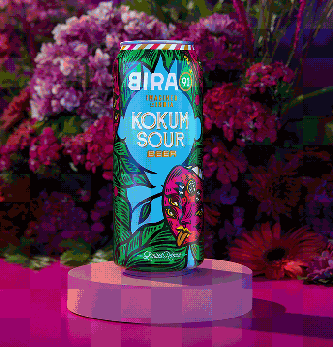
IMAGINED IN INDIA:
Limited Release
India’s fastest-growing craft beer and lifestyle brand looking to expand its audience beyond the beer market.
India’s fastest growing craft beer and lifestyle brand looking to expand it's audience beyonf the beer market.
Visual Identity
Curation
Typography
Packaging
Merchandise
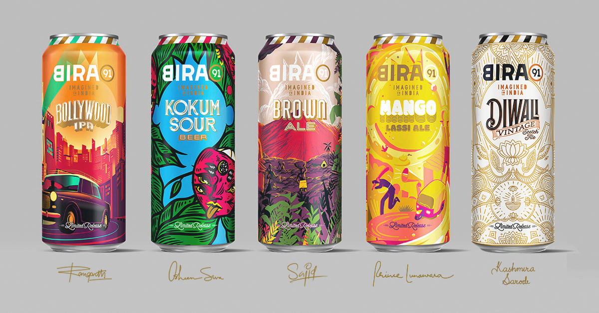
2022
1 of 5 Limited Releases coming out in 2022 - Created within a framework for multiple artists to adapt their designs and extend across multiple brand touchpoints.

Curated Artists -
Ranganath Krishnamani
Osheen Siva
M. Sajid
Prince Lunawara
Kashmira Sarode
India is surging with the new creative energy of artists, entrepreneurs and start-ups. With an eye to export to the rest of the world, Bira 91 needed to reassert their Indian identity and uniqueness in a global marketplace. To achieve this the Bira 91 team and I developed the idea of small batch limited drops that drew from Indian seasonal ingredients, experimental flavours and corresponding art created by India's leading graphic artists.
India is surging with the new creative energy of artists, entrepreneurs and start-ups. With an eye to export to the rest of the world, Bira91 needed to reassert their Indian identity and uniqueness in a global marketplace. To achieve this the Bira91 team and I developed the idea of small batch limited drops that drew from Indian seasonal ingredients, experimental flavours and corresponding art created by India's leading graphic artists.
I wanted to create a unified system across the user experiences that still had enough flexibility for the artists to create within. Art direction stemmed from researching the handcrafted natural ingredients and flavour profiles coupled with custom typography units and curating artists that could breath authenticity and life into each concept. To translate the artists artworks into prototypes across touch points, creating their campaign, “Imagined In India”
I wanted to create a unified system across the user experiences that still had enough flexibility for the artists to create within. Art direction stemmed from researching the handcrafted natural ingredients and flavour profiles coupled with custom typography units and curating artists that could breath authenticity and life into each concept. To translate the artists artworks into prototypes across touch points, creating their campaign, “Imagined In India”
Custom logotypes - crafted around each seasonal flavors
Small batch production achieved through high quality shrink wrap technology for beer cans, with gold finishing used on branding.
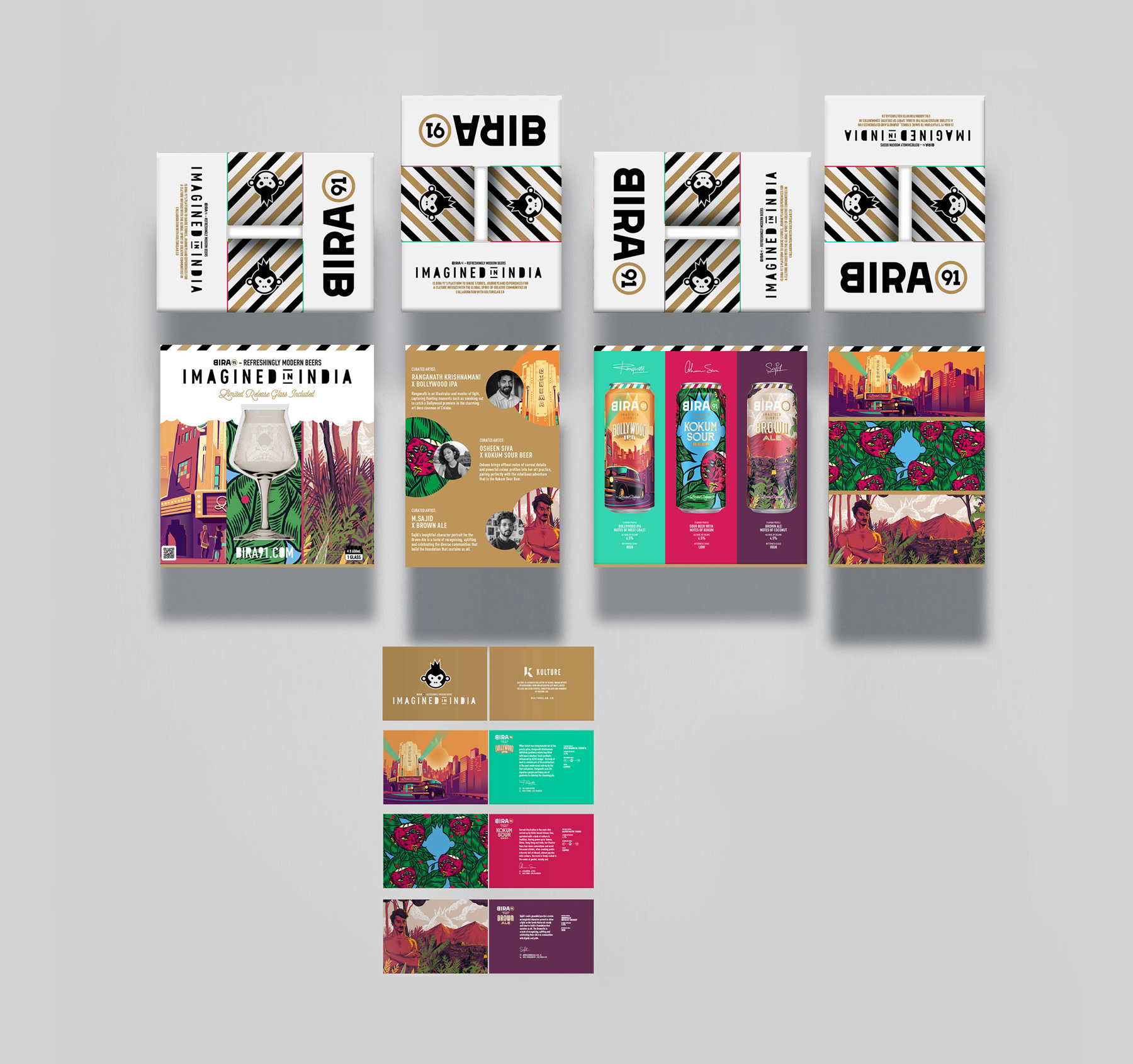
Tasting Kit Multipack
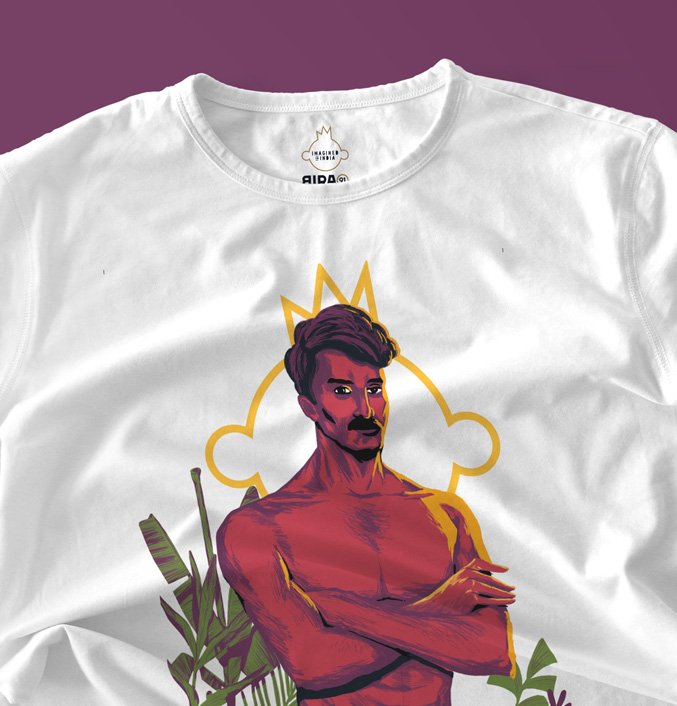
Merchandise developed around each Limited Release flavour
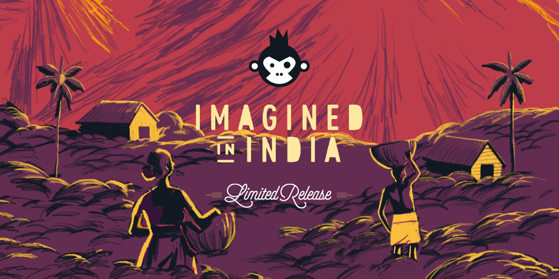
IMAGINED IN IINDIA - Limited Relese 2022
OUTCOME
The full range of four beers will be launched globally in Limited Release drops throughout 2022 aligned with sourcing of seasonal ingredients. The final result is a re-imagination and celebration of art, experimentation, culture, and locally flavors to create a modern palette for global appeal.
Creative Lead - Sneha Iyer
Asistant Art Directior - Drasti Sheth
Content Writer - Tanya Chandani
Product photography: Bira91
My work on art for music started with album art for Daniel Bedingfield and The Corrs while at East London’s graphic design studio Stylo Rouge, which has been at the forefront of the record sleeve and iconic pop culture imagery for the last 30 years.
I was fully immersed in London’s nightlife and found myself creating and designing for the majority of the underground music scene. This ran the gamut from running the legendary music collective Shiva Soundsystem’s entire design output for 10 years to record sleeve designs for labels such as Deep Medi and various club-night identities across musical genres. Moving to India in 2010 to check out the flip side, I continued to champion this dialogue between art, culture and music, with a myriad of designs for bands & projects such as Bobby Friction, Arjun Vagle, BLOT, and Karsh Kale.
My work on art for music started with album art for Daniel Bedingfield and The Corrs while at East London’s graphic design studio Stylo Rouge, who have been at the forefront of record sleeve and iconic pop culture imagery for the last 30 years.
I was fully immersed in London’s nightlife and found myself creating and designing for the majority of the underground music scene. This ran the gamut from running the legendary music collective Shiva Soundsystem’s entire design output for 10 years to record sleeve design for labels such as Deep Medi and various club-night identities across musical genres. Moving to India in 2010 to check out thee flipside, I continued to champion this dialogue between art, cultue and music, with a myriad of designs for bands & projects such as Arjun Vagle, BLOT and Karsh Kale.
Record Label -
Stiff Kittens Records
Discography -
Stiff0001
Stiff0002
Visual Identity
Packaging
Promotions
Merchandise
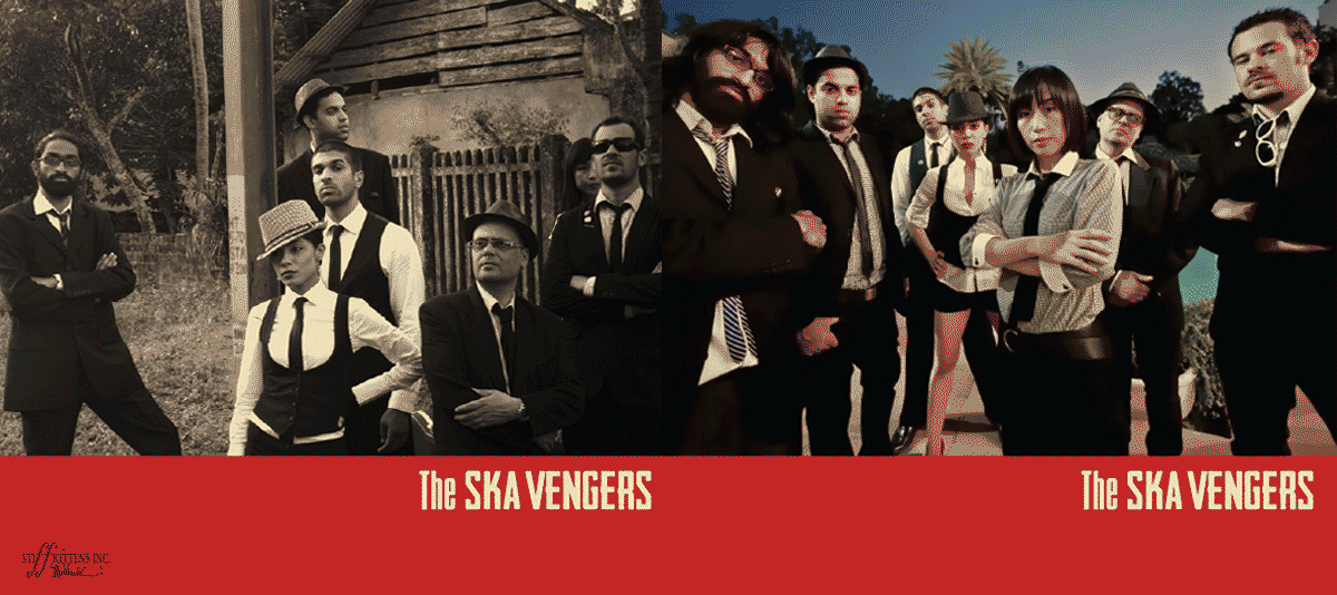
Band Members -
Delhi Sultanat
Flexi K’ Kaye
The Late Nikhil Vasudevan
Raghav ‘diggy’ Dang
Tony ‘bass’ Guinard
Rie Ona
Yohei Saito
Juan Carranza
Video -
Directed by Q
ANOVERDOSEJOINT
2012 - 2017
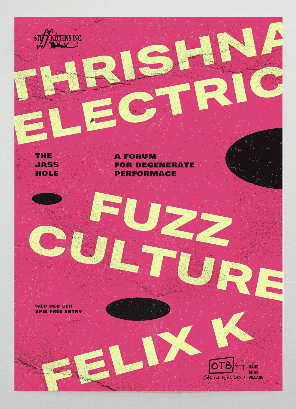
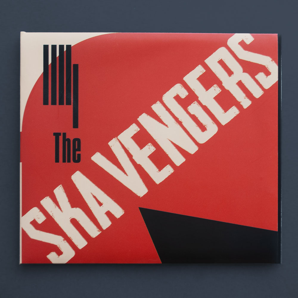
STIFF001
DEBUT
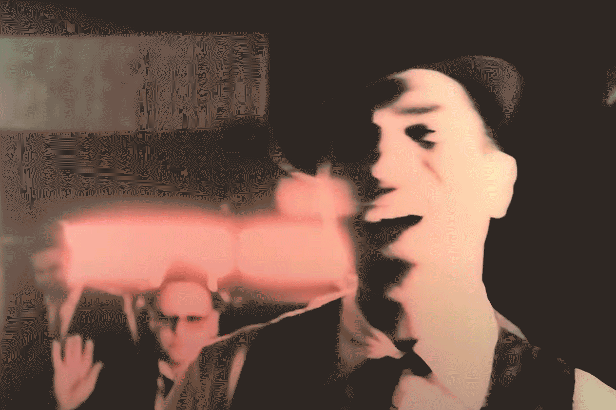
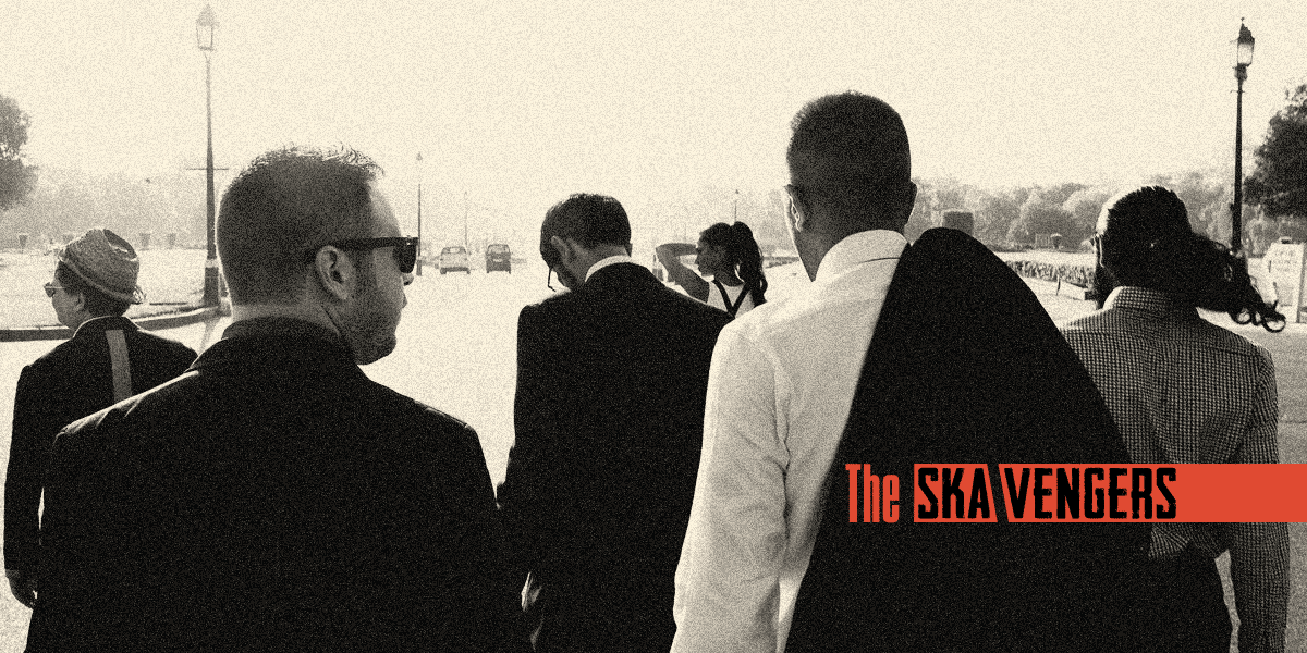
The Ska Vengers are a six-piece assortment coming to you straight out of Delhi. Known for their signature blends of dub, punk, jazz, and rap infused with bold political statements. The band first showcased through club nights such as Ska Ska Ska. A homegrown collaboration in 2012 with Stiff Kitten Recordings showcasing new talent in the indie scene.
The club posters featured repeat typography in bold, rhythmic patterns with a sense of revolution with punk sparkles across the palette. This aesthetic approach evolved into the brand's logotype.
The Ska Vengers visual identity draws inspiration from a crucible of musical genres from punk and Jamaican ska to propaganda posters and Russian constructivism paired with the refinement of classical jazz record sleeves.
It's in the little things that this design echos.
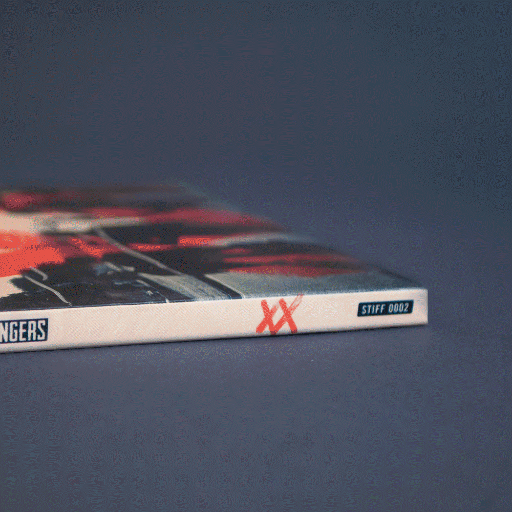
STIFF002
XX / DOUBLE CROSS
The band's second album, XX dropped in 2017 and saw them sharpen and evolve their sound. This time the rumpus reggae, dance and jazz blend was fuelled with more political bite, balancing somewhere in between a protest and a party. Ska! Ska! Ska! The design evolved to reflect this tone and took on more texture and hints of disorder.
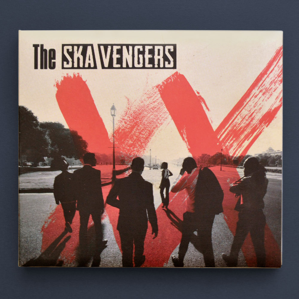
The agneda around all of us in India had changed, the cover captued the grit and textures of a struggle for freedom of one owns of voice, rights and opinions.
Album Photography -
Sachin Soni
Nitin Singh
Parikhit Pal
Sarah Lankford
Record Label -
ST inc.
Discography -
STR001
Visual Identity
Packaging
Promotions
Brand Members -
Jeet Thayil
Suman Sridhar
Amit Ahuja
Virendra G.Kaith
2012
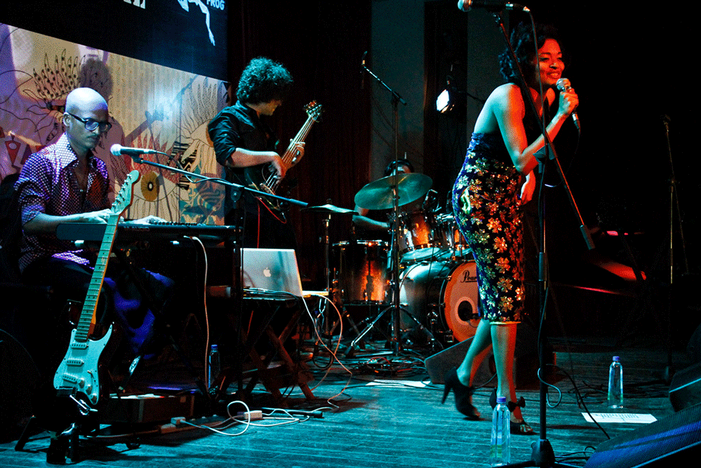
STD Live at Blue Frog, Mumbai 2012
Photographs by Monisha Ajgaonkar for Rolling Stones, India.
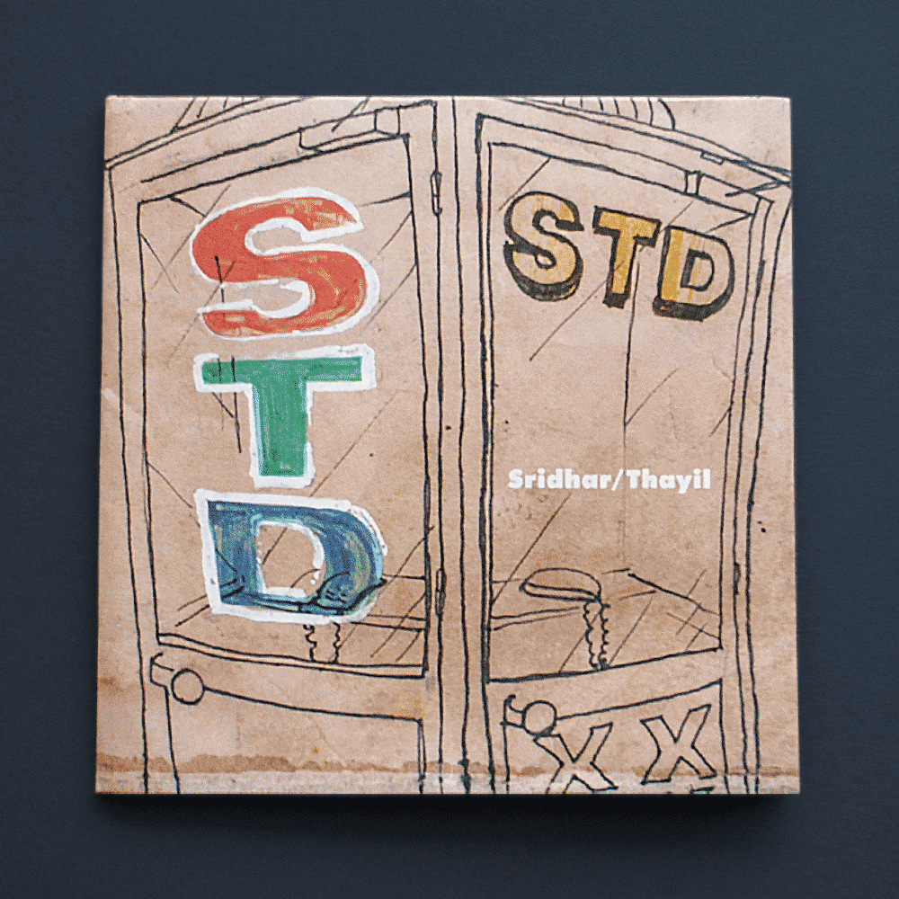
(SELF TITLED DEBUT)
Man Booker Prize laureate Jeet Thayil, and Bollywood siren & celebutante Suman Sridhar came together to form STD; an experimental duo of debauchery, soft words, and brutal noise music reverberating Mumbai dance floors. The band is known for its culture of collaborative spontaneity, where innovation is born in the moment and art.
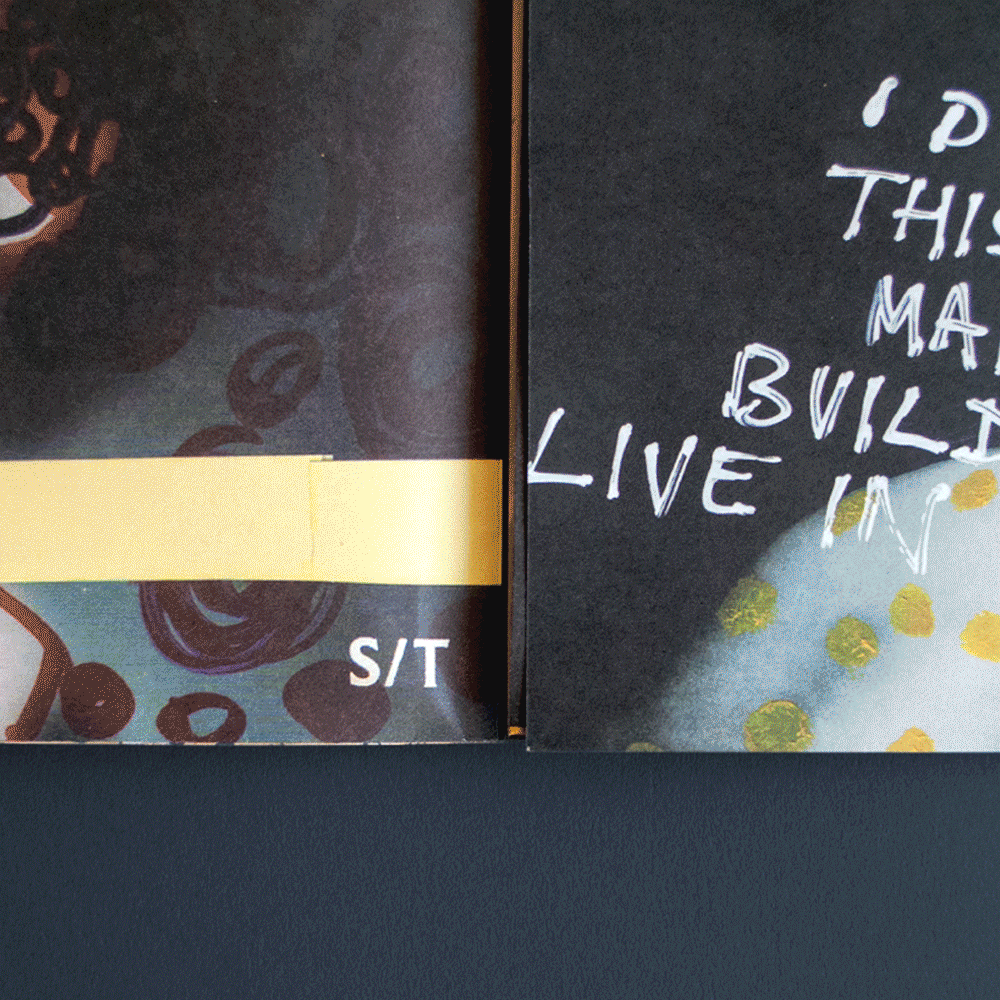
Fold-out poster design + CD packaging, printed on matt 200gsm paper
Series of collage experiments and tour poster.
PROCESS
The band name and self-titled album were deliberately provocative. Being the initials of the band members and acronyms for sexually transmitted diseases and subscriber trunk dialing - a once common long-distance phone booth in India. The booths are used to house the privacy of everything from business dealings to dirty talk. I dove into the photography of Shivani Gupta to hunt down captures of these retro gems to call a friend.
Suman, Jeet, and I mulled over many nights of wine and collage as we pieced together each panel of the final artwork. We wanted an informal, punk format for the packaging that took our process into account via a fold-out lo-fi album/square poster wrapped around a beloved CD. The project supported a DIY ideology with a series of posters deployed across multiple Indian cities.
